
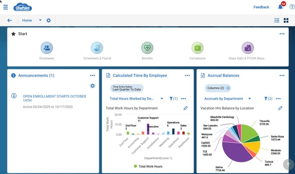
One exciting feature in our revamped user interface is the visual HR analytics and dynamic dashboards. the OnePoint system is unique in that every report can be turned into a dashboard or a chart. Administrators can customize dashboards with the reports most important to them and change them as priorities shift or different analytics take priority.
New User Experience Resources
Get familiar with interactive walkthroughs! Available on the New User Experience page, our interactive walkthroughs guide users around the new look and feel of OnePoint HCM. Available walkthroughs include:
- New UI Menu
- Manager Timesheet Experience
- Employee Timesheet and PTO Request
- New UI Reporting
- Employee Profile & Checklist Experience
Follow the orange prompts in these videos to experience how to navigate basic functions in the the new user interface.
Dashboards: Dashboards and data visualization are exclusive to the new UI. Administrators can configure dashboards any way that support their
Home Dashboard: Set up your home dashboard for the commonly used reports you need today and change them as your priorities evolve and change through the years.
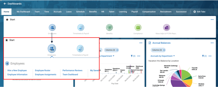
Quick Links:
Quick links are a new navigation enhancement to allow you to quickly access routine processes, workflows, reports and different areas of the application without having to use the full menu.
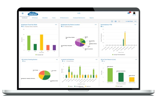
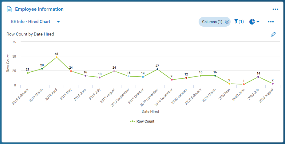
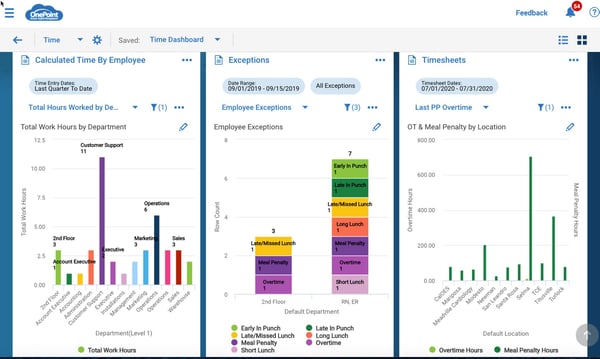
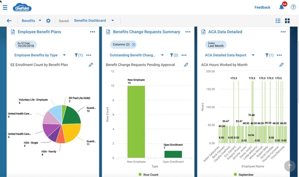
Remember each module tab also can be customized to your preferences as well, this gives you almost limitless options to view widgets, charts, and graphs, or a mix of all three on whatever topics you need. And remember the charts are dynamic so if you need to drill into a certain aspect of a bar graph or pie chart just click on it and it takes you to that filtered view for more analysis. Listed below are examples of dashboards featuring common analytics used by HR and Payroll administrators.
HR Dashboard
Hiring Trends
Time Keeping Dashboard
Benefits Dashboard
Payroll Dashboard
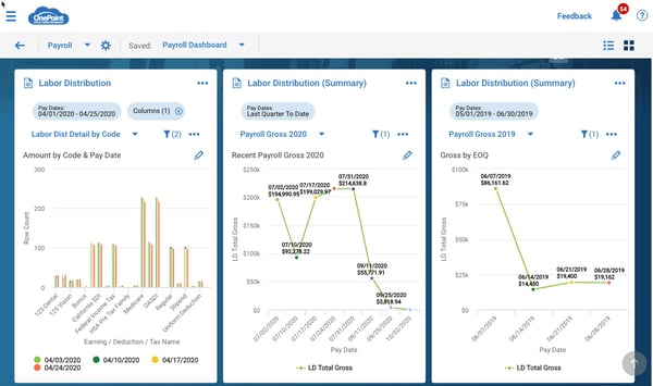
Notice that each module tab can be customized to showcase the HR analytics and dashboards related to that workforce management function. Make sure you take full advantage of these new features and enhancements to get information you need fast and the flexible analytics to monitor key workforce metrics and enable better decision making. For the user guide on reports, charts and dashboard, check out the New User Experience page.
Subscribe to updates
Get the latest posts delivered to your inbox.